Mobile Apps
Mobile app design: 10 best practices, with good and bad examples
Good mobile app design helps people finish one task quickly, with one thumb, in a distracting place. The best practices that matter most are one main action per screen, controls within easy reach, tap targets big enough to hit, readable text, short onboarding, clear error messages and testing with real users. None of them need a big budget.
This guide covers ten mobile app design best practices for founders, with side-by-side examples of what to avoid and what to do instead. They apply whether you design the app yourself or brief a designer.
1. Mobile app design starts with one main action per screen
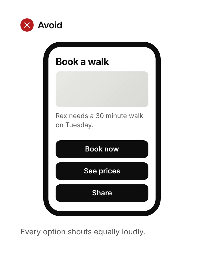
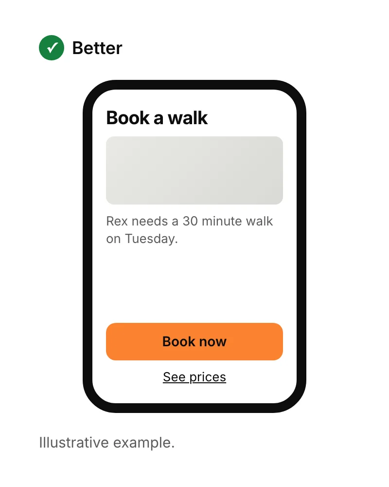
Each screen in a mobile app should have one obvious next step. When several buttons look equally important, people stop and think, and some give up. Make the main action the most prominent button, and show secondary options as quieter links or in a menu.
2. Put key controls within thumb reach
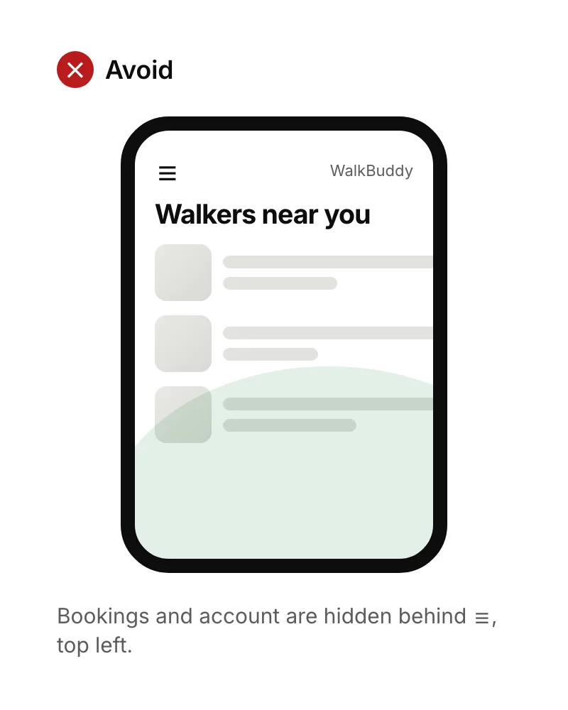
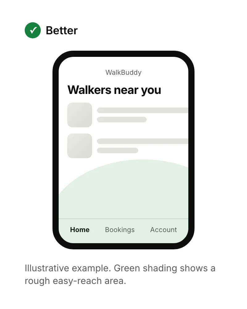
Many people use their phone with one hand, so mobile app design should keep frequent actions in the lower part of the screen. In a 2013 study of 1,333 people using phones in public, Steven Hoober found 49% of those touching the screen used one hand. Phones have grown since, which makes the top corners even harder to reach.
3. Make tap targets big enough
Buttons, links and icons need to be large enough to tap without hitting their neighbours. Google recommends touch targets of at least 48 by 48 dp on Android, which it says is about 9 mm. Apple recommends at least 44 by 44 points on iPhone. The visible icon can be smaller, as long as the area that responds to a tap isn't.
4. Make text easy to read
Text in a mobile app should be readable in bright light, at arm's length and at the size the user has chosen in their phone's settings. Use high contrast: the WCAG guidelines ask for at least 4.5:1 for normal text. Avoid thin fonts and pale grey text, and test the app with the phone's largest text setting switched on.
5. Keep onboarding short: mobile app onboarding best practices
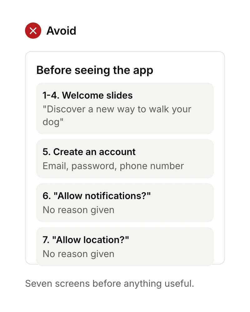
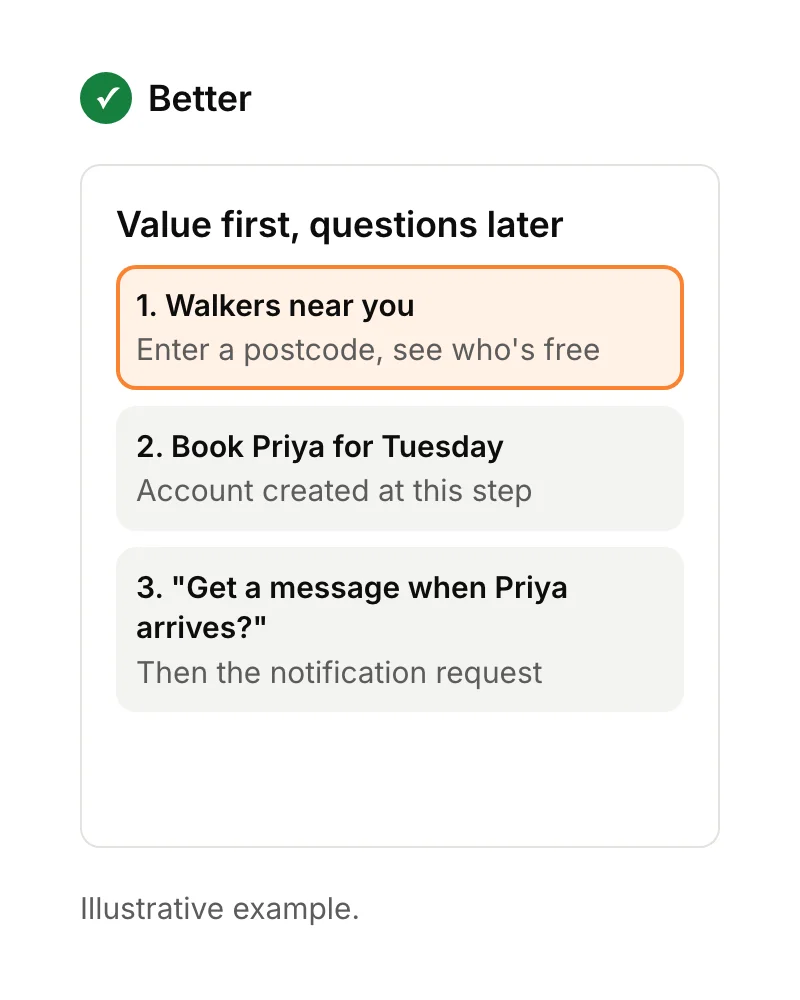
The best onboarding gets people to the app's main benefit as fast as possible. Skip long intro slides, let people try something before asking them to sign up where you can, and ask for permissions like notifications at the moment they make sense, with a line explaining why.
6. Write error messages that say what to do
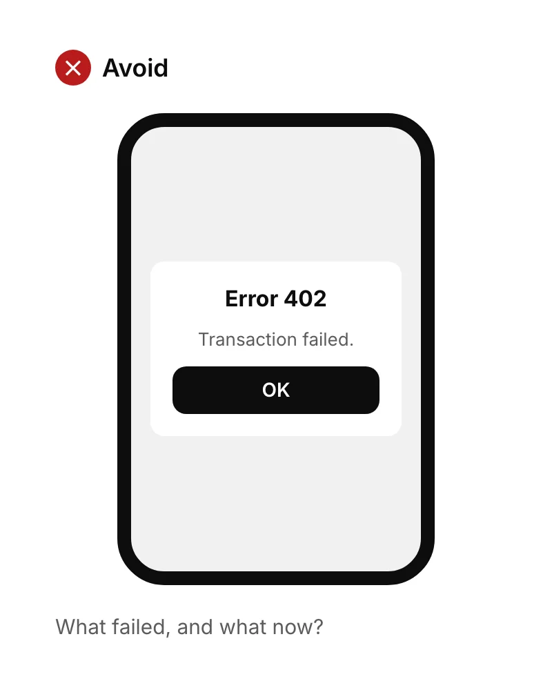
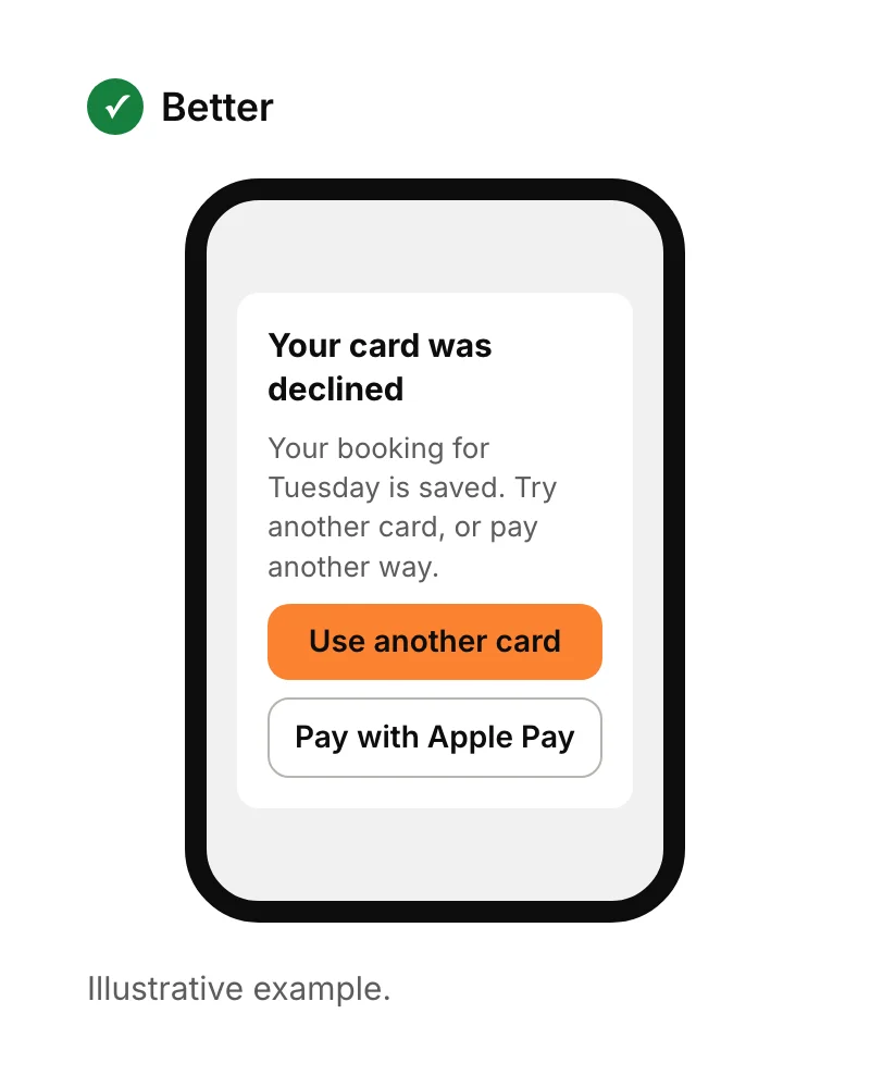
An error message should say what went wrong in plain words and what the person can do next. Codes and jargon leave people stuck. Keep what they've already typed, point to the field that needs fixing, and offer the quickest way forward.
7. Always show what's happening
People should never wonder whether a tap worked. Show a pressed state on buttons, a progress indicator for anything that takes more than a moment, and a clear confirmation when something is done, such as "Booking confirmed for Tuesday at 2pm". Silence feels like a crash.
8. Follow the mobile app design patterns people already know
Mobile app design works best when it behaves like the rest of the phone. Use familiar patterns for navigation, back gestures, search and settings, so people don't have to learn your app before they can use it. Save originality for the parts that make your product different.
9. Design with real content and empty screens
Design screens with realistic names, prices and photos, not neat placeholder text, because long names and missing photos break layouts. Also design the empty state: what a new user sees before they have any bookings, messages or data. A helpful empty screen tells them how to get started.
10. Test your mobile app design with real users, then measure
You can't judge your own app's design objectively, so test it. Give five people a task on a clickable prototype and watch where they hesitate; Jakob Nielsen recommended several small rounds like this rather than one big study. After launch, analytics show where people drop out of each task.
We set up Mixpanel on every app by default for exactly this, and our UI/UX design service includes clickable prototypes and unlimited revisions. For the difference between the two sides of design, read UX vs UI, and for the build itself, see how to create an app.
Sources
- Steven Hoober, How do users really hold mobile devices?, UXmatters, 18 February 2013.
- Google, Touch target size. Checked 15 September 2026.
- Apple, Human Interface Guidelines: Accessibility.
- W3C, Understanding Success Criterion 1.4.3: Contrast (Minimum). Checked 15 September 2026.
- Nielsen Norman Group, Why you only need to test with 5 users, March 2000.