Websites
UX vs UI: what's the difference, and what does your website need?
UX vs UI is the difference between how something works and how it looks. UX (user experience) is the whole experience of using a website or app: can people find what they need and get the job done easily? UI (user interface) is the screens they touch: the layout, buttons, colours and text. Good products need both, but UX comes first.
This guide explains each in plain terms, shows examples where one is good and the other isn't, and sets out what a founder actually needs when building a website or app.
What is UX design?
UX design is shaping how a product works for the people using it. Nielsen Norman Group defines user experience as all aspects of the end user's interaction with a company, its services and its products. In practice, a UX designer works out who the users are and what they're trying to do. Then they find the simplest path to get it done.
Typical UX work includes talking to users, mapping the steps they take and sketching wireframes (simple black-and-white layouts). It also covers building clickable prototypes and watching people test them. So when people ask what UX means in web design, the short answer is: whether visitors can find things, understand them and act without getting stuck.
What is UI design?
UI design is the visual and interactive layer people see and touch: typography, colour, spacing, icons, buttons, and how each element looks when it's pressed, loading or showing an error. A UI designer turns the UX designer's structure into screens that are clear, consistent and on brand.
Good UI work usually produces a design system, a set of reusable components and rules such as button styles and text sizes. That keeps every new screen consistent and makes it quicker to build.
The difference between UI and UX
The difference between UI and UX is scope. UX covers the whole experience, including things users never see, such as how many steps a task takes or how fast a page loads. UI covers the surface: what each screen looks like and how its controls behave. A useful comparison is a house: UX is the floor plan, UI is the paint, fittings and furniture.

In a small team, one person often does both, and that's fine. What matters is that someone is responsible for each set of questions.
UX vs UI examples: good and bad
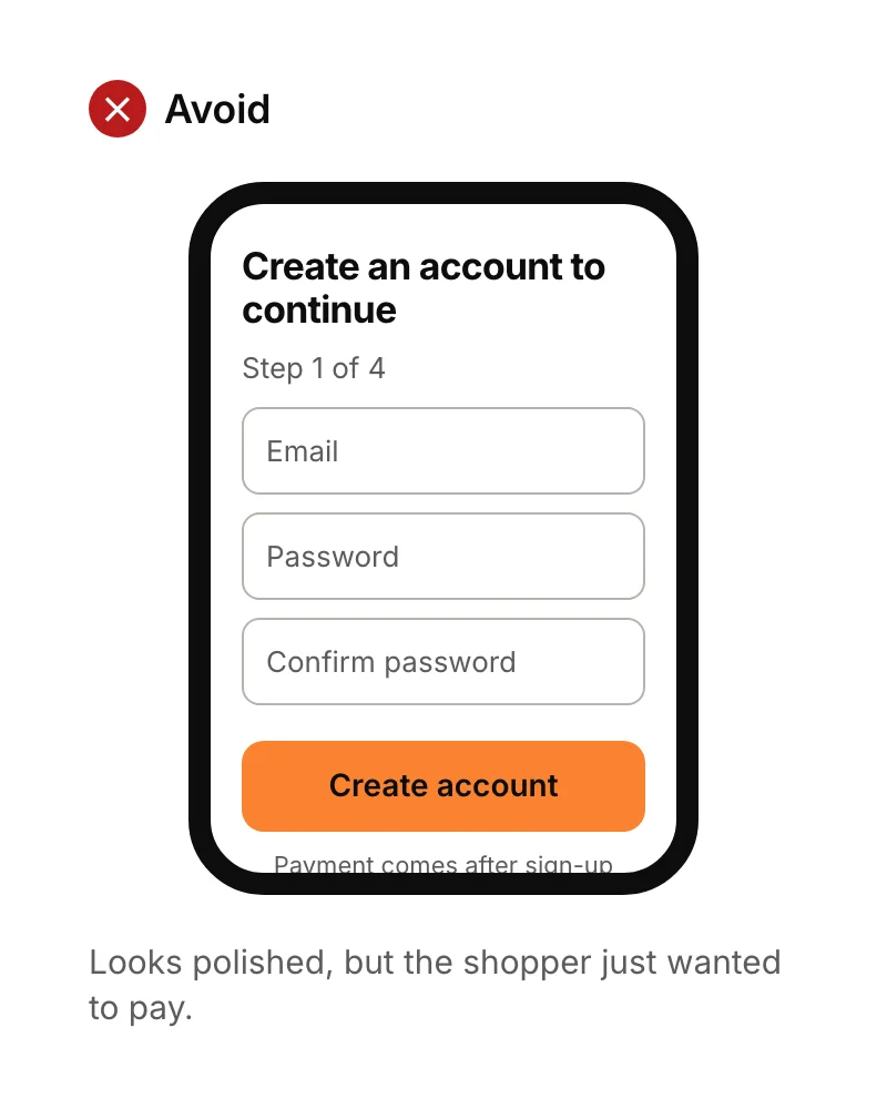
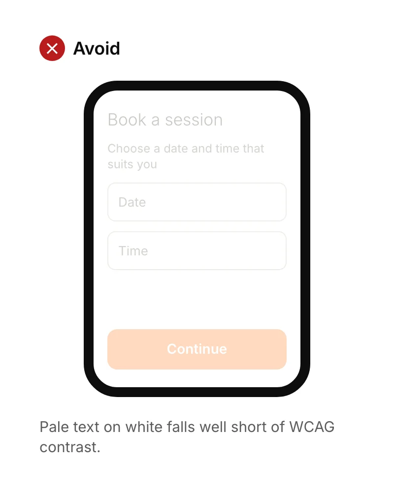
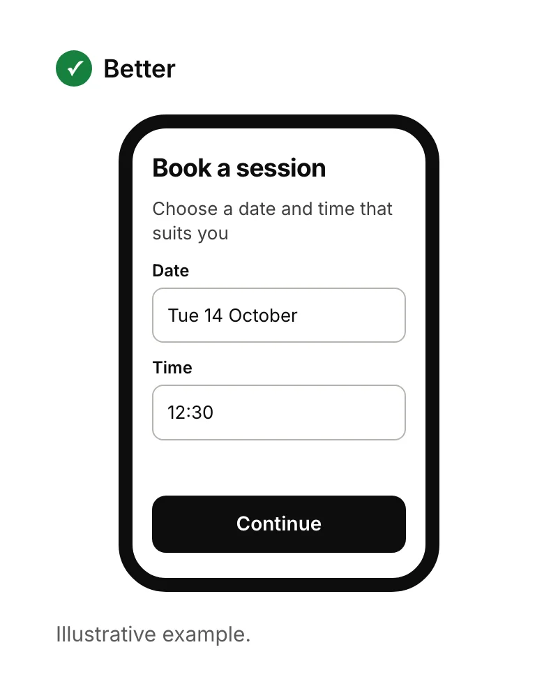
These two pairs show what happens when one side is neglected. The first is a UX problem hidden behind a good-looking screen. The second is a UI problem that makes a sound design hard to use.
Good-looking, but poor UX
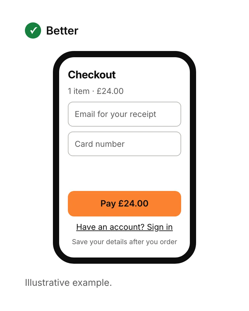
Sound UX, but poor UI
UX vs UI: which matters more?
UX matters more, because a beautiful interface can't rescue a product that doesn't do what people need. Nielsen Norman Group gives the example of a film review site with a flawless interface but a poor database of films: the experience is still bad. Polish the UI of a broken flow and you've paid to make a problem look nicer.
That doesn't make UI optional. People judge trust by how a product looks, and poor UI choices, like low-contrast text or tiny buttons, directly stop people using it. The order is what matters: get the flow right with simple wireframes, then invest in the visual design.
Accessibility is part of both
Accessibility means people with different abilities can all use your product, and both UX and UI affect it. Two concrete rules cover a lot of ground:
- Text contrast. The WCAG guidelines ask for a contrast ratio of at least 4.5:1 for normal text and 3:1 for large text (18 point, or 14 point bold).
- Tap targets. Google recommends touch targets of at least 48 by 48 dp on Android, and Apple's guidelines recommend at least 44 by 44 points on iPhone.
Accessible design is also clearer for everyone: people using a phone in sunlight, with one hand, or in a hurry.
What is UX in web development?
UX in web development is how the build affects the experience: page speed, forms that don't lose what people typed, clear error messages, and layouts that work on every screen size. A design can be perfect in a mockup and still frustrate people if the site is slow or the form breaks on a phone.
Speed is the easiest to measure. Google's Core Web Vitals suggest the main content should load within 2.5 seconds and the page should respond to a tap within 200 milliseconds.
What does a founder's website or app need?
For a simple website or landing page, you need clear UX thinking (one audience, one main action, a short path to it) and clean UI, which a good template can often provide. For an app, you need proper UX work before building: a clickable prototype tested with a handful of users, then a consistent UI and design system.
- Landing page: see what is a landing page for the structure that works.
- Mobile app: see our mobile app design best practices, with examples.
- Getting it designed: our UI/UX design service covers both, with clickable prototypes and unlimited revisions.
Sources
- Nielsen Norman Group, The definition of user experience (UX). Checked 15 September 2026.
- W3C, Understanding Success Criterion 1.4.3: Contrast (Minimum). Checked 15 September 2026.
- Google, Touch target size. Checked 15 September 2026.
- Apple, Human Interface Guidelines: Accessibility.
- web.dev, Web Vitals. Checked 15 September 2026.