Websites
What is a landing page? Examples of what works and what doesn't
What is a landing page? It's a single web page built for one goal, such as getting a visitor to book a call, join a waiting list or buy one product. People usually arrive from an ad, an email or a search result. Unlike a homepage, a landing page removes distractions so the visitor has one clear thing to do.
This guide explains how a landing page differs from a homepage and a website, what a good one contains, and shows side-by-side examples of what works and what doesn't. It's written for founders planning a page to test an idea, launch an app or run ads.
Landing page vs homepage vs website
A website is your whole online presence. A homepage is its front door, built for every kind of visitor, with links to everything. A landing page is built for one type of visitor arriving for one reason, and asks them to take one action. So a business usually has one homepage but can have many landing pages.
| Landing page | Homepage | Website | |
|---|---|---|---|
| Goal | One action | Help any visitor find their way | Everything about the business |
| Visitor | One audience, from one source | Everyone | Everyone |
| Navigation menu | Usually none | Yes | Yes |
| Measured by | Share of visitors who take the action | Where visitors go next | Overall enquiries and sales |
What makes a good landing page?
A good landing page makes one promise to one audience and makes the next step obvious. It has a headline that states the outcome, a line saying who it's for, one clear button, specific proof, a short explanation of how it works, and answers to the doubts that stop people acting.

- A headline that states the outcome. What the visitor gets, in their words.
- Who it's for. One line that lets the right visitor recognise themselves.
- One clear action. A single button, repeated down the page if it's long.
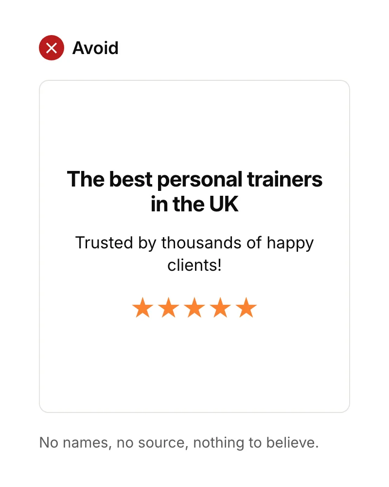
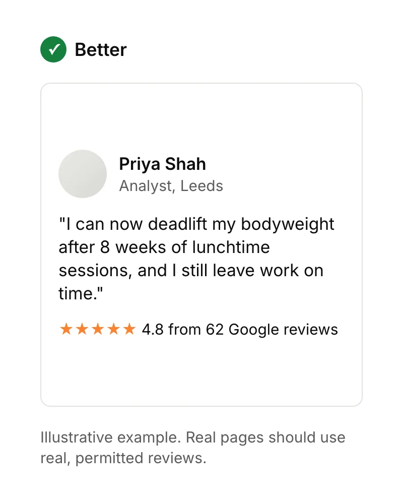
- Specific proof. Named reviews, ratings with a source, or results with numbers.
- How it works. Three or so short steps, so the action feels safe.
- Answers to doubts. Price, time, cancellation, privacy: whatever stops people clicking.
Landing page examples: what works and what doesn't
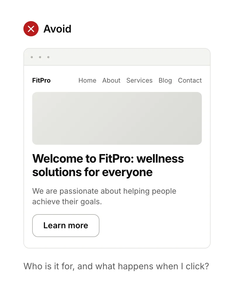
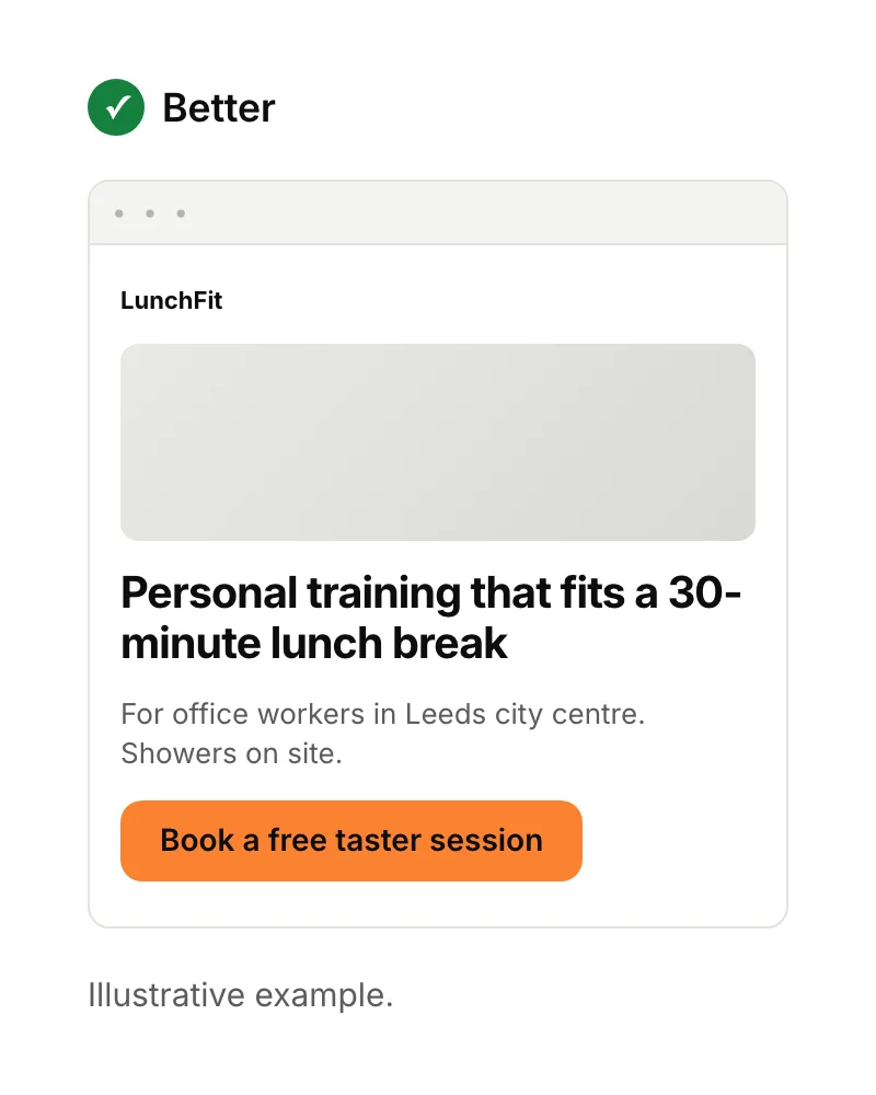
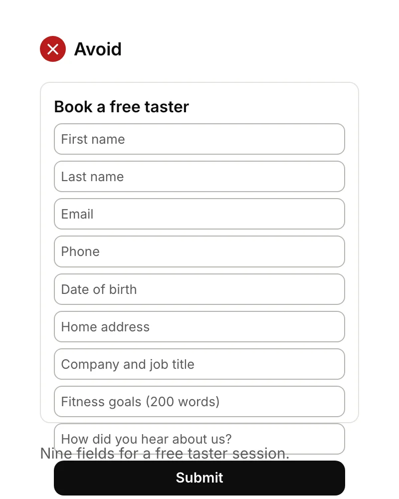
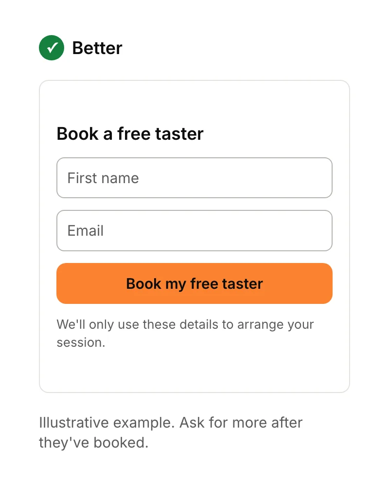
These examples show the same page done two ways. Each pair changes one thing, so you can see exactly what makes the difference.
The message
The form
The proof
Why speed matters on a landing page
Most landing page visitors arrive on a phone from an ad or link, so a slow page loses them before they read the headline. Google's Core Web Vitals set clear targets: the main content should appear within 2.5 seconds, the page should respond to taps within 200 milliseconds, and the layout shift score should be 0.1 or less, for at least 75% of visits.
Speed also affects what ads cost. Google Ads measures landing page experience as how relevant and useful your page is likely to be to people who click your ad, and advises making the page clear, useful and related to what people searched for. In practice: compress images, avoid heavy video at the top, and keep the page focused.
What a UK landing page needs to include
If your business is a limited company, GOV.UK says your website must show the company's registered number, registered office address, where it's registered, and that it's a limited company. If the page collects personal details, you also need a privacy notice under UK GDPR, and consent before setting non-essential cookies. The Information Commissioner's Office explains both.
These usually sit in a short footer, so they don't distract from the main action.
What is a landing page used for?
Use a landing page whenever visitors arrive with one intent you can serve with one action. For founders, the most common uses are:
- Testing an idea with a waiting list before building anything. See how to validate an app idea.
- Launching an app, explaining it and linking to the App Store and Google Play.
- Running ads, with a separate page matching each ad's message.
- Selling one service to one audience, such as a free consultation.
For example, we built a landing page for Afchow, a food delivery app bringing Afro-Caribbean dishes to people's doors. Its job was to explain the app quickly and give visitors a reason to download it, covering the food, easy payments and shorter waits in one place.
How to measure a landing page
Measure a landing page by its conversion rate: the share of visitors who take the action. If 400 people visit and 20 book a taster session, the conversion rate is 5%. Track the action as a key event in Google Analytics, and check where visitors came from, because different sources convert very differently.
To improve it, change one thing at a time, such as the headline, and compare results over enough visits to be sure. If you'd rather have it built for you, see our landing page design service, or read app vs website if you're deciding what to build first.
Sources
- web.dev, Web Vitals. Checked 15 September 2026.
- Google Ads Help, Landing page experience. Checked 15 September 2026.
- GOV.UK, Running a limited company: signs, stationery and promotional material. Checked 15 September 2026.
- Information Commissioner's Office, ico.org.uk.